Table of Contents
Descriptive statistics refers to the branch of statistics that involves summarizing, organizing, and describing data using various numerical measures and graphical representations. It focuses on analyzing and presenting the characteristics of a dataset, without making inferences or generalizations beyond the observed data.
The main purpose of descriptive statistics is to provide a clear and concise summary of the data, allowing for better understanding and interpretation. It involves calculating measures of central tendency (such as the mean, median, and mode) and measures of dispersion (such as the standard deviation, range, and variance) to describe the distribution and variability of the data. Descriptive statistics also include graphical representations, such as histograms, bar charts, pie charts, and scatter plots, to visually depict the data.
Descriptive statistics are useful for exploring and summarizing data, identifying patterns, detecting outliers, and gaining initial insights. They are primarily concerned with the data at hand and do not involve making inferences or generalizations beyond the observed dataset.
Inferential Statistics
Inferential statistics is the branch of statistics that deals with making inferences and drawing conclusions about a population based on sample data. It involves using statistical techniques to generalize findings from a sample to a larger population, providing insights beyond the observed data.
The goal of inferential statistics is to make reliable estimates, predictions, or hypotheses about the population parameters based on sample statistics. It utilizes probability theory and statistical inference methods to quantify the uncertainty and make valid inferences about the population characteristics.
Inferential statistics involve hypothesis testing, confidence intervals, regression analysis, analysis of variance (ANOVA), and other techniques to assess the significance of relationships, differences, or associations in the data. These techniques allow researchers to draw conclusions, make predictions, and understand the broader implications of the data beyond the specific sample.
Descriptive statistics vs Inferential statistics
In summary, descriptive statistics focus on summarizing and describing the characteristics of the data, while inferential statistics aim to make inferences and draw conclusions about a larger population based on sample data. Descriptive statistics provide insights about the data itself, while inferential statistics extend those insights to make broader generalizations and inferences beyond the observed data.
Descriptive Statistics: An Overview
Descriptive statistics provide a summary of the main aspects of the data, without delving into inferential statistics that can predict or test hypotheses. They give a simple overview and can help to understand the structure, main patterns, and any potential outliers or anomalies.
Key Concepts:
1. Central Tendency: Measures that represent the ‘center’ of the data.
- Mean: The average of all the data points.
$$\text{Mean} = \frac{\sum x_i}{n}$$
where xi is an individual data point and n is the total number of data points.
- Median: The middle value when the data points are arranged in ascending or descending order.
- Mode: The most frequently occurring value in the data set
2. Dispersion: Measures that represent how ‘spread out’ the data is.
- Range: Difference between the highest and lowest values.
- Variance: The average of the squared differences from the Mean.
$$\text{Variance} = \frac{\sum (x_i – \text{Mean})^2}{n}$$
- Standard Deviation: The square root of the variance.
.$$\text{Standard Deviation} = \sqrt{\text{Variance}}$$
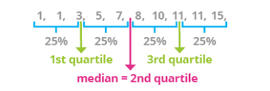
- Quartiles: Values that divide the data into four equal parts. Q1, Q2, and Q3 are the first, second (median), and third quartiles respectively.
3. Shape:
- Skewness: Skewness is a measure of the asymmetry of a distribution. A positive skew indicates that the distribution has a longer tail on the right side, while a negative skew indicates that the distribution has a longer tail on the left side.
- Kurtosis: Kurtosis is a measure of the peakedness of a distribution. A normal distribution has a kurtosis of 3. A distribution with a kurtosis greater than 3 is more peaked than a normal distribution, while a distribution with a kurtosis less than 3 is less peaked than a normal distribution.It is a measure that describes the “tailedness” and the peak of a probability distribution compared to the normal distribution. It helps in identifying the extremities in tails and sharpness of the peak of distributions.
import numpy as np
import scipy.stats as stats

# Sample data
data = [2, 5, 9, 4, 7, 6, 8, 8, 10, 3]

# Central Tendency
mean = np.mean(data)
median = np.median(data)
mode = stats.mode(data)

# Dispersion
range_value = np.ptp(data)  # Peak to peak (max - min)
variance = np.var(data)
std_dev = np.std(data)
quartiles = np.percentile(data, [25, 50, 75])

# Shape
skewness = stats.skew(data)
kurtosis = stats.kurtosis(data)

print(f"Mean: {mean}, Median: {median}, Mode: {mode[0]}")
print(f"Range: {range_value}, Variance: {variance}, Standard Deviation: {std_dev}")
print(f"Q1: {quartiles[0]}, Q2: {quartiles[1]}, Q3: {quartiles[2]}")
print(f"Skewness: {skewness}, Kurtosis: {kurtosis}")
Output
Mean: 6.2, Median: 6.5, Mode: 8
Range: 8, Variance: 6.36, Standard Deviation: 2.5219040425836985
Q1: 4.25, Q2: 6.5, Q3: 8.0
Skewness: -0.18853679207638918, Kurtosis: -1.1880859143230094
Visualization
Visual aids like histograms, box plots, and scatter plots can give an instant idea about the distribution, spread, and relationship between variables. Libraries like matplotlib and seaborn in Python are commonly used for this purpose.
Conclusion
Descriptive statistics offer a foundational understanding of data and are essential before moving on to more complex analyses. They give a snapshot of the data’s main characteristics and can highlight potential areas for deeper investigation or identify the need for data cleaning. Whether you’re doing preliminary data exploration or preparing to present your findings, descriptive statistics are a fundamental tool in data analysis.
Practice Questions
1: Mean Calculation
Data: {5,7,10,14,18}
Mathematical Solution: To calculate the mean:
$$\text{Mean} = \frac{\sum x_i}{n} = \frac{5 + 7 + 10 + 14 + 18}{5} = \frac{54}{5} = 10.8$$
Table:
| Data Point | Value |
| x1 | 5 |
| x2 | 7 |
| x3 | 10 |
| x4 | 14 |
| x5 | 18 |
| Mean | 10.8 |
2: Variance and Standard Deviation
Mathematical Solution: First, we find the deviation of each data point from the mean:
$$\begin{align*}\text{Deviation for } x_1 & = 5 – 10.8 = -5.8 \\\text{Deviation for } x_2 & = 7 – 10.8 = -3.8 \\\text{Deviation for } x_3 & = 10 – 10.8 = -0.8 \\\text{Deviation for } x_4 & = 14 – 10.8 = 3.2 \\\text{Deviation for } x_5 & = 18 – 10.8 = 7.2 \\\end{align*}$$
Variance:
$$\text{Variance} = \frac{\sum (x_i – \text{Mean})^2}{n} = \frac{(-5.8)^2 + (-3.8)^2 + (-0.8)^2 + (3.2)^2 + (7.2)^2}{5}= \frac{33.64 + 14.44 + 0.64 + 10.24 + 51.84}{5} = \frac{110.8}{5} = 22.16$$
Standard Deviation:
$$\text{Standard Deviation} = \sqrt{\text{Variance}} = \sqrt{22.16} \approx 4.71$$
Table:
| Data Point | Value | Deviation from Mean | Squared Deviation |
| x1 | 5 | -5.8 | 33.64 |
| x2 | 7 | -3.8 | 14.44 |
| x3 | 10 | -0.8 | 0.64 |
| x4 | 14 | 3.2 | 10.24 |
| x5 | 18 | 7.2 | 51.84 |
| Variance | 22.16 | ||
| Std. Deviation | 4.71 |
3: Skewness
Mathematical Solution: First, find the median of the data set. Since the data set has an odd number of values and is already sorted:$$\text{Median} = 10$$
Then, compute the skewness:
$$\text{Skewness} = \frac{\text{mean} – \text{median}}{\text{standard deviation}} = \frac{10.8 – 10}{4.71} \approx 0.17$$
Table:
| Measure | Value |
| Mean | 10.8 |
| Median | 10 |
| Std. Dev. | 4.71 |
| Skewness | 0.7 |
4: Quartiles Calculation
Question: Given the data set ( {47, 15, 42, 41, 7, 36, 49, 40, 6, 43, 39} ), calculate the first quartile (Q1), second quartile (Q2 or median), and third quartile (Q3).
Mathematical Solution:
- Sort the data in ascending order: ( {6, 7, 15, 36, 39, 40, 41, 42, 43, 47, 49} )
- Find the median (Q2): There are 11 data points, so the median is the 6th value: ( Q2 = 40 )
- Find Q1: This is the median of the first half of the data. There are 5 data points in the first half, so the first quartile is the 3rd value: ( Q1 = 15 )
- Find Q3: This is the median of the second half of the data. There are 5 data points in the second half, so the third quartile is the 3rd value of the second half, or the 8th value overall: ( Q3 = 43 )
Table:
| Quartile | Value |
|---|---|
| Q1 | 15 |
| Q2 (Median) | 40 |
| Q3 | 43 |
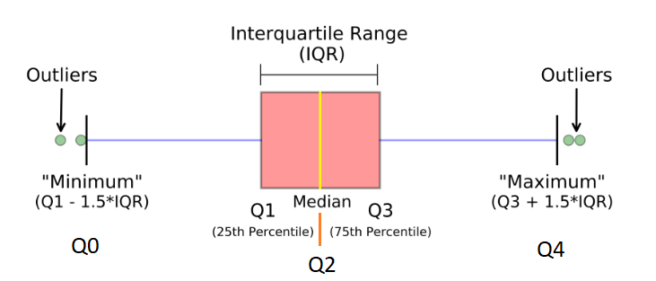
The Interquartile Range (IQR)
The Interquartile Range (IQR) is a crucial concept in statistics, especially when dealing with the spread and dispersion of data.
Interquartile Range (IQR)
The Interquartile Range (IQR) is a measure of statistical dispersion or spread. In simpler terms, it’s a measure of where the “middle fifty” is in a data set. The IQR can be used to identify outliers, with it being less sensitive to them than other measures, such as the variance or standard deviation.
Calculation of IQR
- First, sort the data in ascending order.
- Calculate the First Quartile (Q1): This is the median of the first half of the data. If the number of data points is odd, don’t include the overall median in either half.
- Calculate the Third Quartile (Q3): This is the median of the second half of the data.
- Compute the IQR: Subtract Q1 from Q3.
$$\text{IQR} = Q3 – Q1$$
Why is IQR Important?
- Outlier Detection: Data points that fall below Q1−1.5×IQR or above Q3+1.5×IQR are typically considered outliers.
- Spread of Data: IQR gives a clear indication of the spread of the central 50% of the data, which can be very useful if the data has outliers or extreme values, as these won’t affect the IQR.
- Comparison: IQR can be used to compare the spread of two or more datasets.
Advantages over Range:
Example:
Consider the data set: \[1, 3, 3, 6, 7, 8, 9, 10, 14, 15\]
- Sorted data: \[1, 3, 3, 6, 7, 8, 9, 10, 14, 15\]
- Q1 (median of first half): $$ \frac{3 + 3}{2} = 3 $$
- Q3 (median of second half): $$ \frac{9 + 10}{2} = 9.5 $$
- IQR = $$Q3 – Q1 = 9.5 – 3 = 6.5 $$
To determine the outliers using the IQR method for the given data set \([1, 3, 3, 6, 7, 8, 9, 10, 14, 15]\):
1. Calculate the lower boundary for outliers:
$$\text{Lower Boundary} = Q1 – 1.5 \times \text{IQR} = 3 – 1.5 \times 6.5 = -6.75$$
2. Calculate the upper boundary for outliers:
$$\text{Upper Boundary} = Q3 + 1.5 \times \text{IQR} = 9.5 + 1.5 \times 6.5 = 19.25$$
3. Any data point below the lower boundary or above the upper boundary is considered an outlier.
Based on the calculated boundaries, there are no outliers in the given data set \([1, 3, 3, 6, 7, 8, 9, 10, 14, 15]\). All the data points fall within the range defined by the lower and upper boundaries.
Thus, this data set doesn’t contain any unusually low or high values when evaluated using the IQR method for outlier detection.
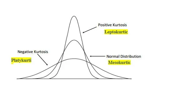
Kurtosis
Kurtosis is a measure that describes the “tailedness” and the peak of a probability distribution compared to the normal distribution. It helps in identifying the extremities in tails and the sharpness of the peak of distributions.
Here’s a deeper look:
Types of Kurtosis:
Mesokurtic (kurtosis=3)
- This is the kurtosis of a standard normal distribution.
- Mesokurtic distributions have a kurtosis of 3, indicating they have a similar kurtosis to the normal distribution.
- The tails of a mesokurtic distribution are similar to that of a normal distribution.
Leptokurtic (kurtosis>3)
- These distributions have heavier tails and a sharper peak than the normal distribution.
- Higher kurtosis means a higher probability of outlier values (events occurring far from the mean).
- Financial data often displays leptokurtosis, indicating the occurrence of extreme events (like market crashes).
Platykurtic (kurtosis<3)
- These distributions have lighter tails and a flatter peak compared to the normal distribution.
- Lower kurtosis indicates a lower probability of outlier values.
Mathematical Definition: The formula for kurtosis is
$$\text{kurtosis}(X) = E\left[\left(\frac{X – \mu}{\sigma}\right)^4\right]$$
Where:
- ( X ) is the random variable
- ( \mu ) is the mean of ( X )
- ( \sigma ) is the standard deviation of ( X )
- ( E ) is the expectation operator
The value 3 is often subtracted from the result to provide a comparison to the normal distribution, resulting in the “excess kurtosis.
Significance
Understanding kurtosis can be essential in many fields, especially in finance and quality control:
- Finance: Recognizing the kurtosis of financial returns helps investors understand the risk of extreme events. A leptokurtic distribution of returns indicates a higher risk of black swan events.
- Quality Control: In manufacturing, understanding the kurtosis of the distribution of product dimensions can help identify potential issues with machinery or processes that might result in more frequent outliers.
In conclusion, kurtosis provides insights into the shape, especially the tails and the peak, of a distribution. While the mean and variance give you a basic idea of the “central location” and “spread” of your data, skewness and kurtosis provide deeper insights into the shape and potential outliers in your distribution.
Frequency Distributions and Histograms
Frequency distributions and histograms are foundational concepts in statistics, particularly in the realm of exploratory data analysis. Let’s delve deeper into each.
Frequency Distributions
A frequency distribution is a summary of how often different values or sets of values appear in a dataset. It’s a way to present data by indicating the number of occurrences of each possible outcome.
Types of Frequency Distributions
- Ungrouped Frequency Distribution: Lists each unique value in a dataset alongside its frequency.
- Grouped Frequency Distribution: Groups values into classes or intervals and lists these classes alongside their frequencies.
$$\text{Relative Frequency of a class} = \frac{\text{Frequency of the class}}{\text{Total number of items}}$$
- Cumulative Frequency: It is the sum of the frequencies of a class and all classes before it.
Histograms
A histogram is a graphical representation of a frequency distribution. It’s similar to a bar graph, but in a histogram, the data is continuous and sorted into “bins” or “classes”.
How to Construct a Histogram
- Determine the Range: Find the difference between the maximum and minimum data values.
- Choose an Appropriate Bin Width: This determines the number of bars in the histogram. The choice of bin width can influence the shape and interpretability of the histogram.
- Sort Data into Bins: Count how many data points fall into each bin.
- Plot the Histogram: The x-axis represents the bins, and the y-axis represents the frequency or count of data points in each bin. Bars are drawn adjacent to one another, emphasizing the continuity of the data.
Histogram vs. Bar Chart
- Histogram: Used for continuous data. Bars touch each other to indicate that there are no gaps in the data.
- Bar Chart: Used for categorical or discrete data. Bars are separated by spaces.
Density Plot
A variation of the histogram where, instead of frequency, the y-axis represents the probability density. The area under the curve sums up to 1.
Importance in Data Science
- Understand Data Distribution: Histograms provide a visual representation of the underlying distribution of the dataset – be it normal, bimodal, skewed, etc.
- Identify Outliers: Extreme values, or gaps in the bars, can indicate potential outliers or anomalies in the data.
- Data Binning: Converting continuous data into discrete bins can sometimes simplify analysis or make certain types of data processing or modeling more feasible.
frequency distributions and histograms are powerful tools for understanding the distribution and spread of data. They provide initial insights into the nature of data, which can be crucial for subsequent data preprocessing and modeling in data science.
Example
Given Data: Suppose we conducted a survey of 30 students to find out how many books they read in a year. Here’s the data we collected: {5,2,9,7,7,6,8,7,4,10,6,5,4,8,6,5,7,5,8,9,3,6,4,8,7,5,6,7,8,9}
1. Ungrouped Frequency Distribution
For this, we’ll list each unique number of books and its corresponding frequency:
| Number of Books | Frequency |
|---|---|
| 2 | 1 |
| 3 | 1 |
| 4 | 3 |
| 5 | 5 |
| 6 | 5 |
| 7 | 6 |
| 8 | 5 |
| 9 | 3 |
| 10 | 1 |
2. Grouped Frequency Distribution
Let’s group the data into bins of width 3:
| Range of Books | Frequency |
|---|---|
| 2-4 | 5 |
| 5-7 | 16 |
| 8-10 | 9 |
3. Histogram
For the histogram, we’d plot the data on a two-dimensional plane, with the range of books (or bins for the grouped data) on the x-axis and frequency on the y-axis.
Ungrouped Histogram:
- X-axis: Number of books (2, 3, 4, 5, 6, 7, 8, 9, 10)
- Y-axis: Frequency (1, 1, 3, 5, 5, 6, 5, 3, 1)
Grouped Histogram:
- X-axis: Range of books (2-4, 5-7, 8-10)
- Y-axis: Frequency (5, 16, 9)
Let’s visualize these histograms.
import matplotlib.pyplot as plt

# Data
data = [5,2,9,7,7,6,8,7,4,10,6,5,4,8,6,5,7,5,8,9,3,6,4,8,7,5,6,7,8,9]

# Create plots
fig, ax = plt.subplots(1, 2, figsize=(14, 6))

# Ungrouped histogram
ax[0].hist(data, bins=[2,3,4,5,6,7,8,9,10,11], edgecolor='black')
ax[0].set_title("Ungrouped Histogram")
ax[0].set_xlabel("Number of Books")
ax[0].set_ylabel("Frequency")
ax[0].set_xticks([2,3,4,5,6,7,8,9,10])

# Grouped histogram
ax[1].hist(data, bins=[2,5,8,11], edgecolor='black', alpha=0.7)
ax[1].set_title("Grouped Histogram")
ax[1].set_xlabel("Range of Books")
ax[1].set_ylabel("Frequency")
ax[1].set_xticks([2,5,8,11])

plt.tight_layout()
plt.show()
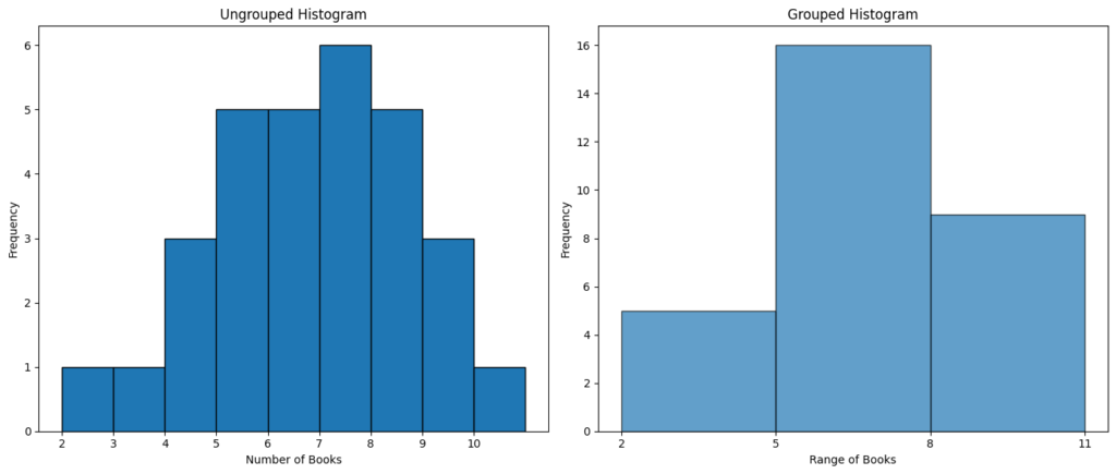
For the Ungrouped Histogram:
- You would see bars of varying heights corresponding to each number of books. For instance, the bar over the number 5 would be taller than the one over number 2, reflecting the higher frequency of students who read 5 books compared to those who read 2.
For the Grouped Histogram:
- The data is bucketed into wider intervals. The bar spanning the range 5-7 would be the tallest since the majority of students read between 5 to 7 books.
To visualize the histograms, you can use software like Excel, Google Sheets, or any data visualization tool like Tableau. If you’re familiar with programming, Python with libraries such as Matplotlib or Seaborn is an excellent choice.
Relative and Cumulative Frequency Distribution
- Ungrouped Frequency Distribution:
For each unique number of books, we will have:
- Frequency: Count of occurrences.
- Relative Frequency: Frequency of a class divided by the total number of items.
- Cumulative Frequency: Sum of frequencies of a class and all classes before it.
| Number of Books | Frequency | Relative Frequency | Cumulative Frequency |
|---|---|---|---|
| 2 | 1 | 0.0333 | 1 |
| 3 | 1 | 0.0333 | 2 |
| 4 | 3 | 0.1000 | 5 |
| 5 | 5 | 0.1667 | 10 |
| 6 | 5 | 0.1667 | 15 |
| 7 | 6 | 0.2000 | 21 |
| 8 | 5 | 0.1667 | 26 |
| 9 | 3 | 0.1000 | 29 |
| 10 | 1 | 0.0333 | 30 |
- Frequency column tells us how many students read a certain number of books.
- Relative Frequency gives the proportion of students for each number of books out of the total.
- Cumulative Frequency keeps a running total, indicating how many students have read up to a certain number of books.
Next, we’ll do a similar analysis for the grouped data.
| Range of Books | Frequency | Relative Frequency | Cumulative Frequency |
|---|---|---|---|
| [2, 5) | 5 | 0.1667 | 5 |
| [5, 8) | 16 | 0.5333 | 21 |
| [8, 11) | 9 | 0.3000 | 30 |
- Frequency column tells us how many students read a certain range of books.
- Relative Frequency provides the proportion of students for each range of books out of the total.
- Cumulative Frequency maintains a running total, indicating how many students have read up to a certain range of books.
Take Away:
- 16 out of 30 students (or 53.33%) read between 5 to 8 books.
- By the third group ([8, 11)), a total of 30 students have been accounted for, which matches the size of our dataset.
The choice between ungrouped and grouped frequency distributions often depends on the granularity of insights required and the nature of the data.
